
Modern poetry is a hard sell; many publishers won’t touch it with a barge pole or in fact any type of poking stick. Presumably this is not because they deem poetry immoral, decadent or depraved, but because it rarely breaks even. Publishers are in business to make money (just ask Harry Potter). An audience exists for poetry, but it’s a relatively small one. This is why, as John Tottenham has said (in an interview with Rebekah Weikel), “all poetry is doomed to obscurity”; as a result “there is no recognised standard of quality because there is no ‘supply meets demand’ dynamic such as exists in music or art where middlemen are perpetually scurrying around trying to satisfy the appetites of an ever-multiplying audience hungry for whatever mediocre rubbish is thrown at them.”
Poets often start out by testing the waters in poetry magazines or journals. If successful, this may lead to the publication of a chapbook, which commonly takes the form of a low-cost pamphlet or magazine. These tend to be simply made, sometimes crudely stapled, more rarely a big budget extravaganza. There’s also something called a “broadside”, one page with a poem on it, almost like a poster. If the poet is a big gun through being extraordinarily talented – or simply lucky – he or she may go on to have a proper book released. Even then, if it can be found anywhere on a retail shelf, it’s unlikely a book of poems will sell in droves or as the metaphorical hot cake; if ever you pass a patisserie and spot a few shady characters lurking around outside in sunglasses, these are probably poets, casing the joint for a midnight break-in to liberate lemon tarts and coffee éclairs.
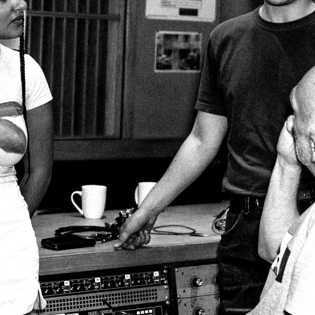
Four by two is eight, except when it’s a limited edition paper and ink quarterly, printed on a single sheet bent five times and glued or stapled to post consumer waste. It’s somewhat of a new approach to publishing poetry – not a magazine, journal or chapbook, but in its own new category: poems wrapped in origami (not to be confused with haiku). In the circumstances of the business facts already described, any new format should surely be welcomed. More facts: Four by Two was conceived long-distance by Klipschutz (a poet living in San Francisco, also co-writer of many fine songs with Yep Roc recording artist Chuck Prophet) and Jeremy Gaulke (resident of Richmond, and a designer, illustrator and printer).
As of early December 2014, three issues of this beautiful publication have been produced, with Klipschutz serving as house poet, editor and curator. The first issue, Spring, features the modern, almost surrealist poetry of Canadian ex-pat Jon Cone; his poems are quirkily humorous and experimental, with sharp, jagged language, a little like those of the French modernist Max Jacob. Klipschutz occupies the centre spread, as the resident poet-cum-porn star of Four by Two. For the first issue, his theme is “the ransacked alphabet”, and the design cleverly matches this. His poem “M Bellies Up To The Bar” is a standout in both alphabetical and poetic terms.
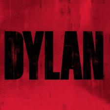
The second issue, Summer, is devoted to San Francisco, and the format is taken even further; Joie Cook’s poems are printed over a 1947 map of the coastal area (or perhaps in accordance with Larkin, coastal shelf) of Frisco, making the reader think of adventures in new frontiers. According to one of Cook’s poems (“Certain Revelations”), only the birds have direction and human understanding of bigger things is limited; her poetry speaks of tribes and hedonists “hungry for the experience of it all”, themes well suited for the historic cartography of the issue. Klipschutz’s epic, “Apples”, rolls down the centre-spread, with some great fruity artwork by Jeremy Gaulke. The poem itself is a “post-democratic” new world West Coast odyssey, taking in the Gold Rush, “techno-homies”, Raymond Carver, the Andrew Sisters, the Beatles, the Beats and Bob Dylan, cleverly tying everything together through the themes of appetite and re-invention. Going against the convenient mainstream image presented to us in the media, Klipschutz debunks the idea of Steve Jobs as a freewheeling hippy, but the poet is at his best when describing the excitement of the new:
Together they made it happen,
those pocket protector Johnny Appleseeds,
in code-violating semi-detached garages,
stealing John & Paul & George & Ringo’s mojo
to put their stamp on the envelope of the future …
There is a lot packed in to ten stanzas, and it would suit a rowdy public performance at somewhere like the Six Gallery, if of course, it still existed.
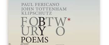
The third issue, Fall, zones in on L.A. and includes poems by Paul Fericano, John Tottenham and Klipschutz. This time the paper is folded differently, making it a slightly easier experience for the reader. Fericano’s poems, short and snappily inventive like a fast-talking Raymond Chandler, are backed with artwork of Hollywood icons. As for the other contributions, Tottenham excels in extending Larkin-esque British miserablism to new comic depths (“positivity requires too much energy/ and even if I were happy/ I wouldn’t admit it/ for that would be insulting/ to those who are not/ and those who pretend to be”). His dark humour seems enriched by the environment as he tires of the mocking sun, numbing warmth and beautiful women of L.A.
Klipschutz again spreads his wings in the centre-pages for “Ambition”, a prose poem set on a Greyhound bus. The poem and accompanying artwork are both excellent; Klipschutz’s narrative is skilfully compact, setting out different perspectives of the characters in the poem, relayed in almost cinematographic style. With colourful, vibrant graphics, this is an evocative and powerful look at the draw of Hollywood, contrasting the differences between success in the entertainment industry with lives more ordinary.
According to Chuck Prophet, Four by Two tastes like lemon meringue pie; perhaps it’s good enough to eat, but I cannot guarantee the paper will not give you indigestion. It is however an unusually physical publication unlike any other; the requirement to fold and unfold the pages ensures that the reader pays attention to the experience; the design is bold and enhances the overall focus of each issue; the writing is engaging, of high quality. This is porn for poetry lovers and fans of cool graphic design, with more to come.
Read our interview with Jeremy Gaulke here
FIRST PUBLISHED ZOUCH MAGAZINE 11 Dec 2014


Leave a comment